Flowers to Art 19
Filigree ikebana compositions, masterpieces by local floral designers and insights into Indian floristry: the Flowers to Art exhibition once again set new accents in 2025. Selected florists developed ideas for the eleventh edition that touched thousands of people.
Trudi Demut + Claudia Morgenthaler
 i
i
4.3.–9.3.2025
Florale Interpretation: Claudia Morgenthaler, Aarau
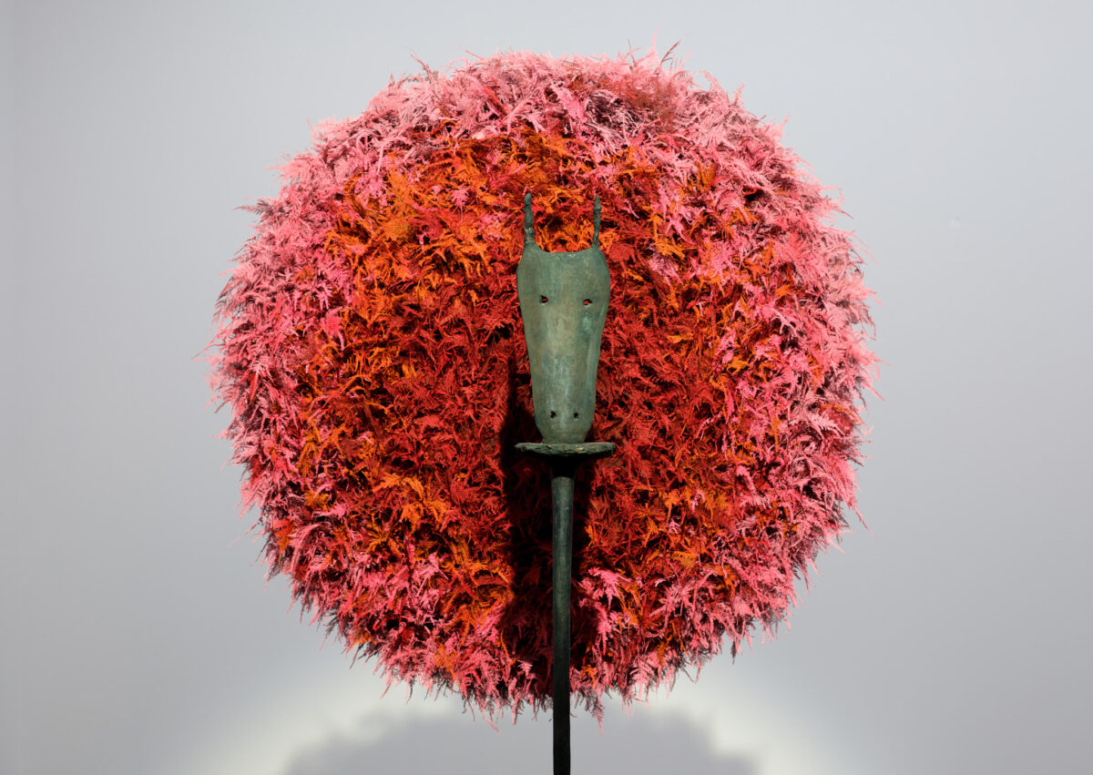
Werk: Trudi Demut, Maske, 1980
Aargauer Kunsthaus / Schenkung der Hans und Wilma Stutz-Stiftung
Foto: David Aebi, Burgdorf
This sculpture by Zurich artist Trudi Demut was created during an important phase in her artistic career: the transition from abstraction to figuration. The work combines plain, simple forms with an interest in mythological creatures. It consists of a slender column on which a fragile-looking mask is placed. The bronze work is reminiscent of a totem. However, the artist rejects the monumentality of such ritual sculptures here.
The sculpture Maske (Mask) reminds Claudia Morgenthaler ‘that we all wear a mask from time to time to protect our vulnerability.’ With her floral interpretation, the master florist would therefore like to emphasise that ‘opposites can be hidden behind the archaic, dark and hard, almost frightening mask with its lovely-looking eyes.’ The red-orange-pink coloured feather asparagus reveals a world of goodness and beauty behind the mask: ‘How it can be light, soft, loving, joyful, warming and tender as soon as we accept our vulnerable part behind our masks’. With an unclouded view behind the mask, a wonderful core opens up to us, symbolised by open flowers in their most beautiful form.
Franz Fedier + Veronika Tsukamoto
 i
i
4.3.–9.3.2025
Florale Interpretation: Veronika Tsukamoto, St. Gallen
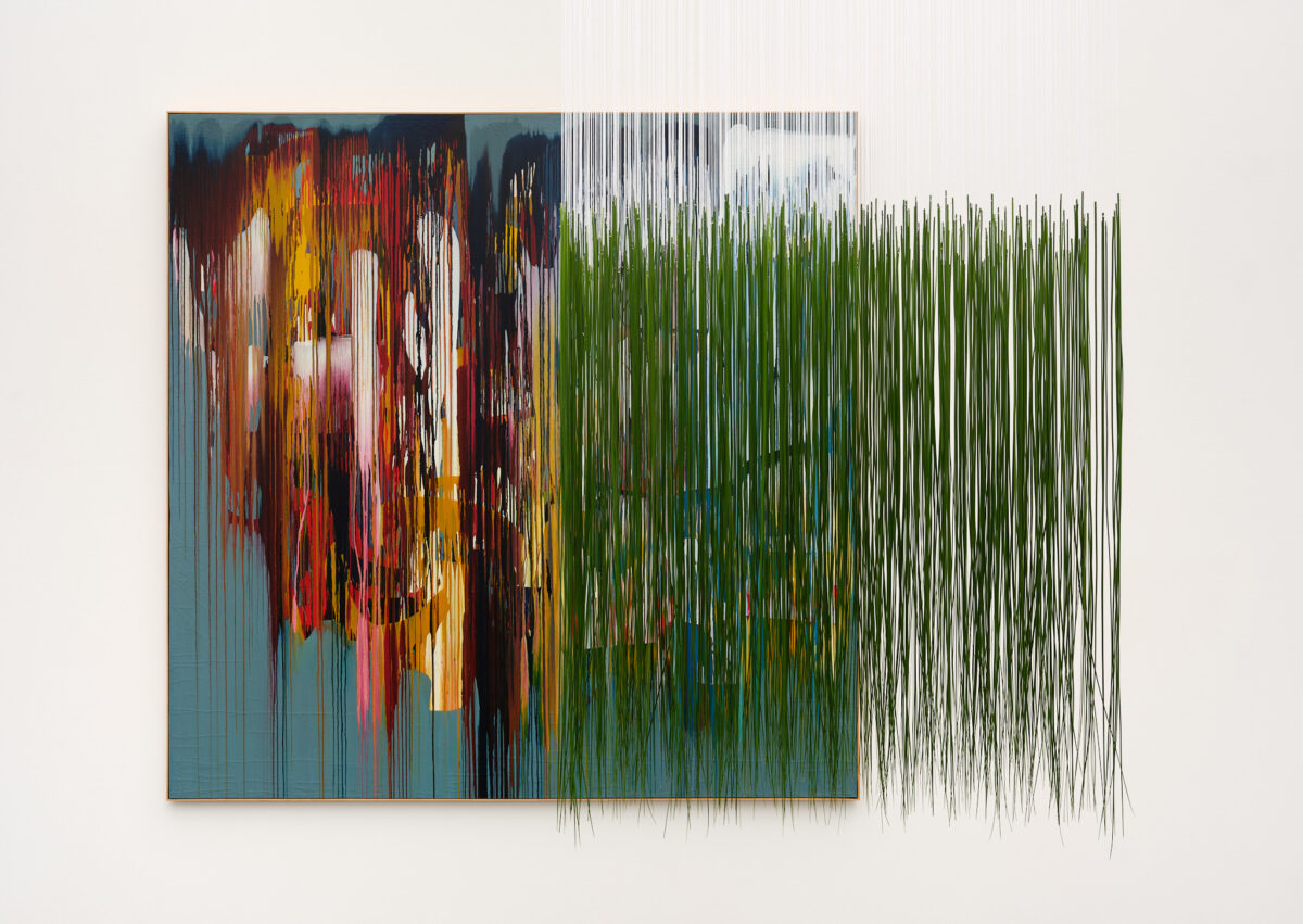
Werk: Franz Fedier, Regenbild (Farbautonomie), 1959
Aargauer Kunsthaus
Foto: David Aebi, Burgdorf
The picture shows an approach to abstract painting that is characteristic of Franz Fedier. The focus is on the material process and the properties of the colour. For Regenbild, the Swiss artist used synthetic resin paints on a canvas to create free colour gradients. Vertical lines contrast with white areas of colour on a petrol-coloured background. Without depicting a specific motif, the work evokes associations with the rainbow.
Veronika Tsukamoto’s floral interpretation takes the free colour gradients of Fedier’s painting as its starting point. A floating, transparent cube of grasses (steelgrass) guides the flow of filigree, vertical lines into the room. The green of the grass symbolises growth – the colour radiates calm and originality. Rain is the origin of life, an uncontrollable, elemental natural phenomenon. The white threads pick up on the white elements applied to the surface of the painting and make symbolic reference to the light that is refracted in the raindrops and becomes visible in shimmering rainbow colours. The bright colours in Fedier’s work permeate the floral design and enhance its transparency.
Marianne Kuhn + Franziska Bürgi Rey
 i
i
4.3.–9.3.2025
Florale Interpretation: Franziska Bürgi Rey, Kreuzlingen
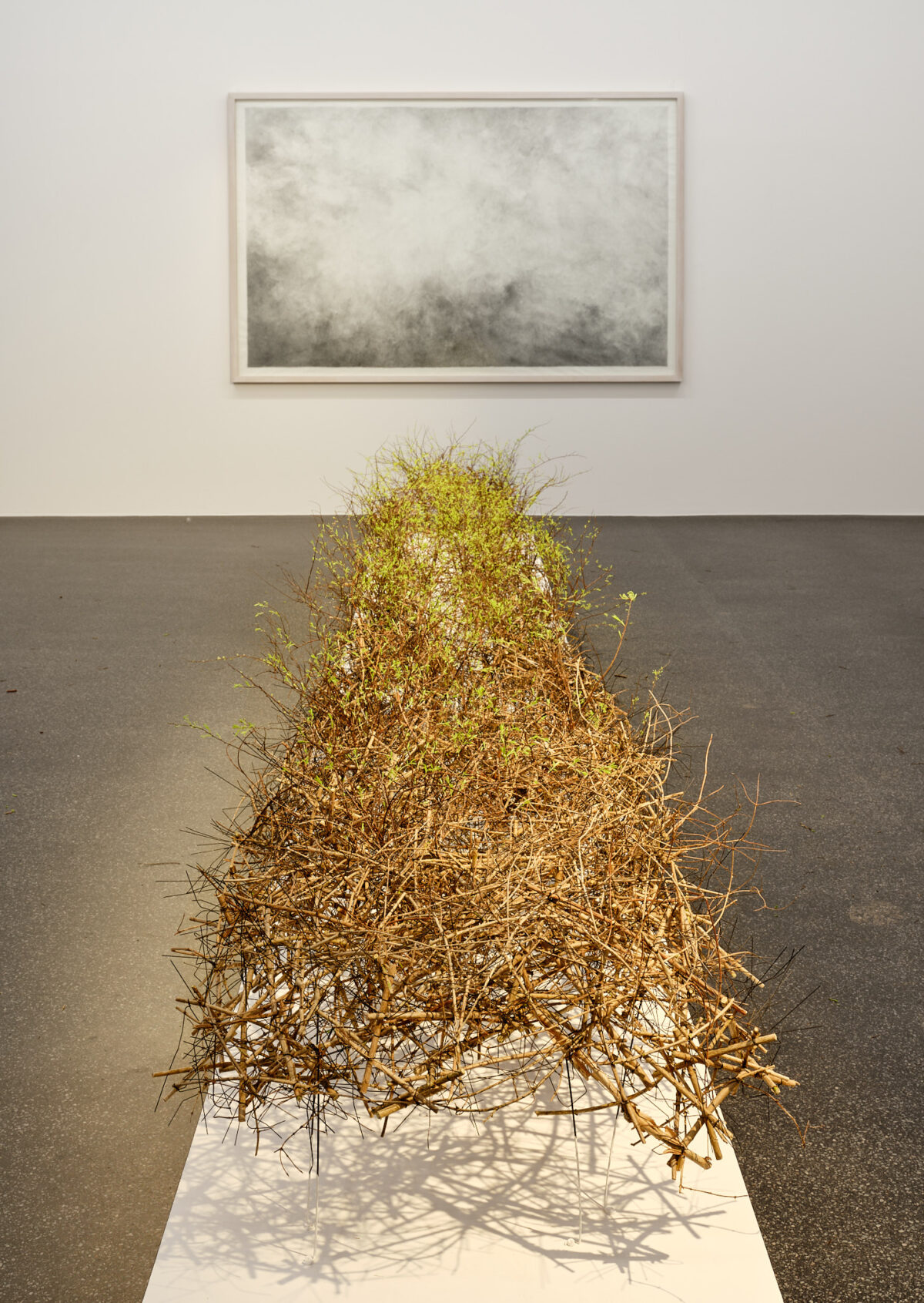
Werk: Marianne Kuhn, Ohne Titel, 1994
Aargauer Kunsthaus
Foto: David Aebi, Burgdorf
This work on paper, acquired by the Aargauer Kunsthaus in 1995, shows a cloud-like texture made of graphite. The colour tone becomes lighter and lighter from the dark edges towards the centre. Viewed close up, both densification and thinning can be observed in this work. If we take a step back, we recognise that the graphite strokes form dark swirls and waves. At the same time, the white of the paper is still visible in some places.
Franziska Bürgi Rey was fascinated by the impression of clouds or wafts of mist passing by in the graphite drawing from the very beginning. The ‘cloud movements’ inspired the flower arranger to go further and distort the drawing to a width of 65 centimetres and a length of 5.5 metres. This approach results in new condensations, but without changing the overall expression of the drawing. The technique of cutting fine branches and then reassembling them piece by piece – as in drawing – forms the basis for the floral interpretation. The wires as a technical aid also have a graphic expression and connect the branches and the pencil line of the picture. The shadows cast in turn multiply the lines. The white blossoms grow and open like a veil of mist that comes and goes.
Léopold Robert + Anita Leuthold
 i
i
4.3.–9.3.2025
Florale Interpretation: Anita Leuthold, Winterthur
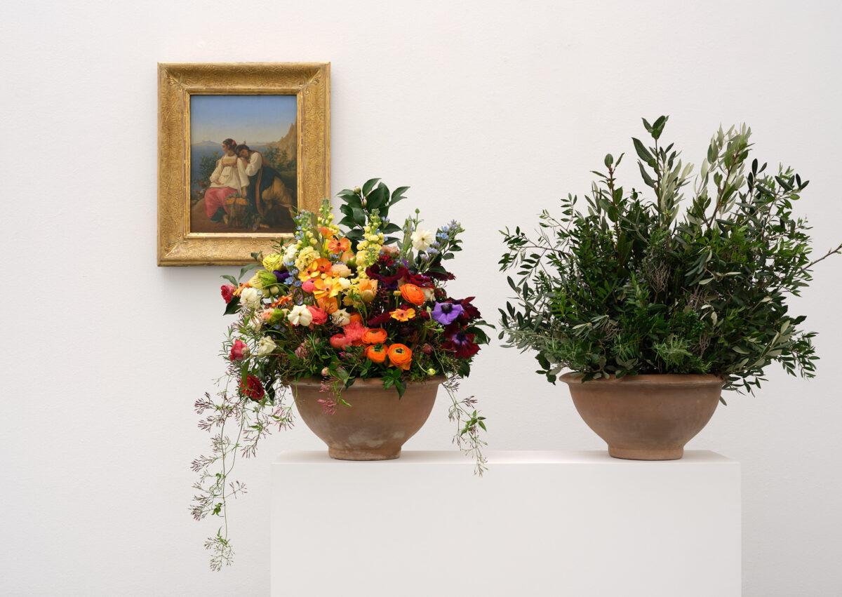
Werk: Léopold Robert, Orangenpflückerinnen auf Capri, 1824
Aargauer Kunsthaus / Depositum der Gottfried Keller-Stiftung, Bundesamt für Kultur, Bern
Foto: David Aebi, Burgdorf
The small-format painting shows two women resting in an orange grove on Capri under a blue sky. A mandolin player plays in the background. Robert, who came from the Jura, is known for his genre paintings and depictions of everyday scenes. In this work, he captures the beauty of the Italian landscape. With strong, cool colours and classical precision, the painting was created during Robert’s creative years in Italy (1818 – 1835).
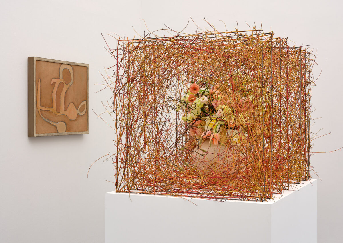
Based on the Mediterranean atmosphere, Anita Leuthold imagined ‘the scent of oranges and the warm, moist earth’ for her floral interpretation. The cloudless blue sky and the proximity of the sea evoke a longing for the south. Anita Leuthold conveys the sensual, ideal mood of the picture by using two classic terracotta vases. While one vessel is filled with the fragrant vegetation of the maquis, the floral filling of the second vase alludes to the textures and colours of the clothes. It was important to the master florist that all the flowers come from Italian cultivation (anemones, carnations, ranunculus, rosemary, spice laurel, myrtle, olive, camellia, cherry, jasmine and holm oak).
Andriu Deplazes + Katrin Riedwyl
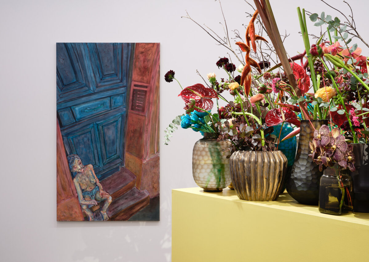 i
i
4.3.–9.3.2025
Florale Interpretation: Katrin Riedwyl, Spiez
Werk: Andriu Deplazes, Regard tordu sur corps assis, 2023
Aargauer Kunsthaus
© 2025, ProLitteris, Zürich
Foto: David Aebi, Burgdorf
Born in Zurich in 1993, Andriu Deplazes paints solitary figures that visualise social paradoxes. The artist uses a vibrant colour palette to intensify the psychological and disturbing complexity of his subject matter. In Regard tordu sur corps assis, the gaze becomes the subject: from above, we look at a slender, presumably female figure with a naked upper body. In her vulnerability, she sits on a doorstep and seems to look at us with a restless gaze.
The restless gaze (regard tordu) of the lonely person has touched Katrin Riedwyl deeply. For the master florist, however, gazes can not only be restless, but also arrogant, humiliating and threatening. For the master florist, this fundamentally raises ‘the question of power and powerlessness in the way we scrutinise and encounter one another.’ The cube with its numerous vessels and the colour gold illustrates the status of wealth, materialism, success and luxury. Noble flowers, some with a strong desire for recognition and individuality, such as orchids, hanging heliconias, imperial crowns, flamingo flowers, callas and tulips emphasise this attitude. Turquoise-coloured flowers symbolise aloofness and power and man’s arrogance in wanting to dominate everything – including nature.
Leiko Ikemura + Shreeram Kulkarni und Adarsh Suresh
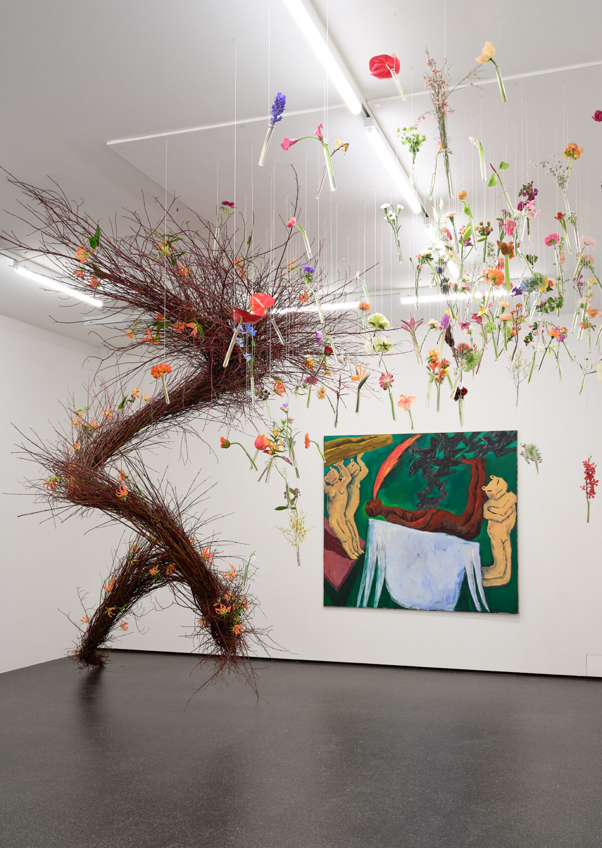 i
i
4.3.–9.3.2025
Florale Interpretation: Shreeram Kulkarni & Adarsh Suresh, Mumbai (IND)
Werk: Leiko Ikemura, Sterbebett, 1983
Aargauer Kunsthaus / Depositum Eva Sonderegger-Schweizer
Foto: David Aebi, Burgdorf
The work Sterbebett (Deathbed) thematises the transition between life and death and thus reflects Leiko Ikemura’s lifelong fascination with the mysterious ‘in-between’. The work shows a brown, human-like figure on a green background, lying on a white structure and surrounded by cat-like hybrid creatures. While dark birds appear to be attacking the figure, red flames escape from its mouth. The work is characteristic of Ikemura’s creative phase in the early 1980s, especially her first years in Germany. This period is characterised by a violent visual language.
The floral interpretation of Shreeram Kulkarni and Adarsh Suresh symbolises the journey of the soul beyond life, inspired by the Hindu pilgrimage site Manikarnika Ghat in Varanasi (IND). A fiery tail of gloriosa flowers (fire lily) and red twigs (dogwood) symbolises the flames of combustion that liberate the soul. Floating, unbound blossoms symbolise divine acceptance and the soul’s ascent into eternity. 144 test tubes and twelve different types of flowers reflect the cosmic cycles of the Hindu festival Maha Kumbh and the spiritual renewal of the planet Jupiter. The creation captures the moment of transcendence and celebrates the blossoming of the soul into eternity.
Karl Ballmer + Melina Anderegg
 i
i
4.3.–9.3.2025
Florale Interpretation: Melina Anderegg, Unterengstringen
Werk: Karl Ballmer, Engel, um 1926/1927
Aargauer Kunsthaus / Depositum der Karl Ballmer-Stiftung
Foto: David Aebi, Burgdorf
The artwork from 1926 and 1927 shows an abstract depiction of an angel. The Aargau artist Karl Ballmer was inspired by Rudolf Steiner’s anthroposophical texts. The reduced forms are painted with earthy colours in an opaque, impasto application. The strong lines create a sculptural relief effect, whereby the angel appears to hover as a transcendent figure between the earthly and spiritual worlds.
In her floral interpretation, Melina Anderegg aims to make Ballmer’s abstract depiction of the angel three-dimensional and thus depict it not only as a spiritual, but also as a grounded and material being. The depth effect – represented by fine wired dogwood mesh – is intended to convey Ballmer’s artistic process. Inspired by the Pavatex underlay of the work, the weave also reflects the (invisible) world of thought, which is interrupted by a dominant and deliberately colourful but unobtrusive floral filling of ranunculus and flowering branches in a light-coloured clay vase.
Silvia Bächli + Clirae Dupraz
 i
i
4.3.–9.3.2025
Florale Interpretation: Claire Dupraz, Jussy
Werk: Silvia Bächli, Projektor, 1986
Aargauer Kunsthaus
Foto: David Aebi, Burgdorf
The work Projektor by Basel-based artist Silvia Bächli impressively illustrates her economical, precise way of working with gouache on paper. Black gouache is applied to white paper in varying degrees of transparency. While some objects – such as a chair – are recognisable, many forms remain abstract. Bächli deliberately refrains from finalising her works and leaves them open to interpretation. She sees her pictures as ‘half-caught sentences’. The artist favours hanging them in multi-part arrangements. In her opinion, this allows room for free associations.
For Claire Dupraz, Bächli’s projector contains forms from both the visible and the invisible world – but for the florist, this work is also about ‘impressions, feelings and nuances’. Who can really say what there is to see and thus recognise? Based on her imagination, Dupraz develops a floral visual language that unites these different levels of perception. In doing so, the florist also refers to the question of where the limits of our perception begin. Dupraz therefore responds to Bächli’s abstract artistic approach with the finest branches, surface textures and a wealth of forms in order to challenge our perception on a floral level too.
Daniel Spoerri + Manuela Bucher
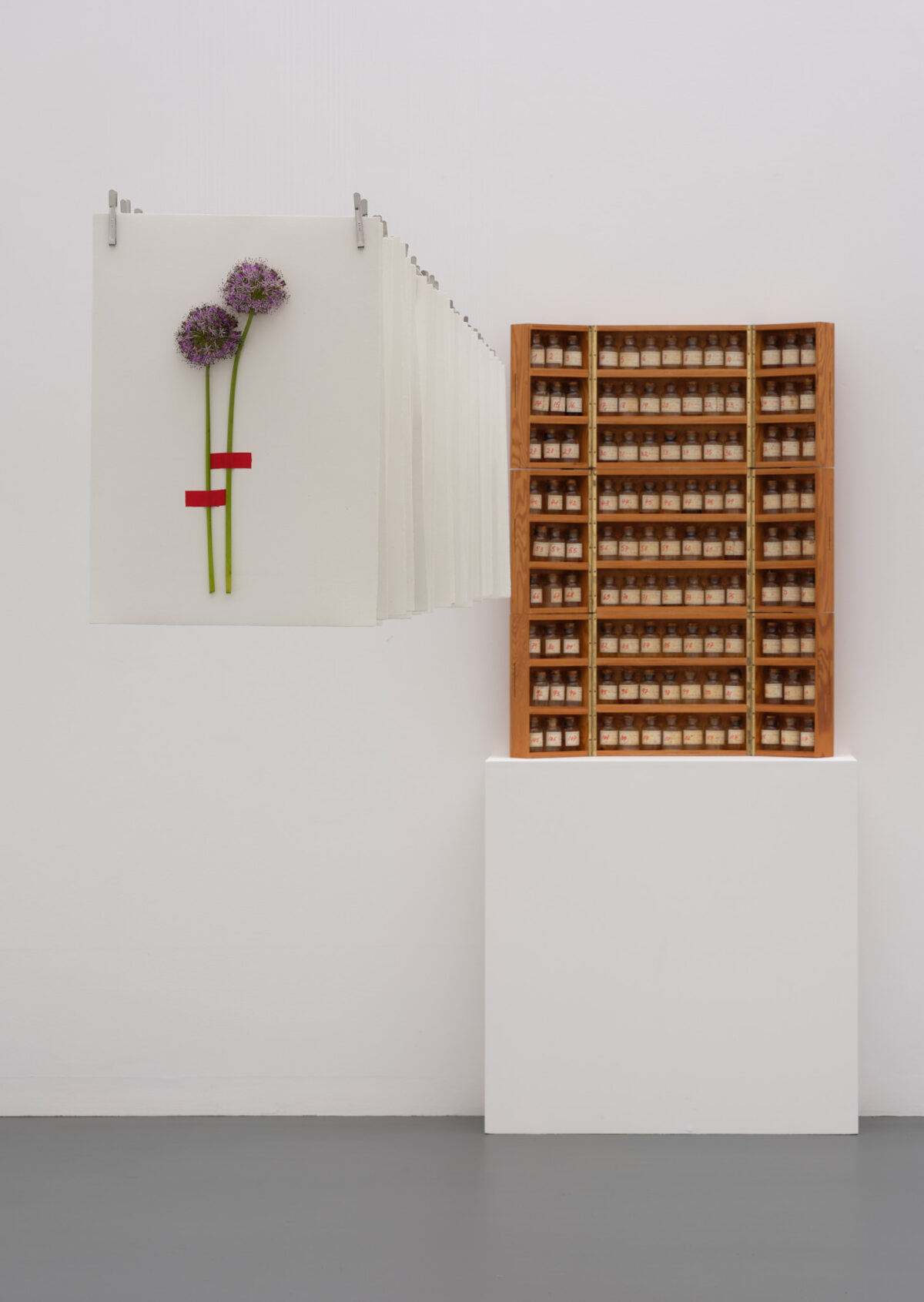 i
i
4.3.–9.3.2025
Florale Interpretation: Manuela Bucher, Aesch
Werk: Daniel Spoerri, La Pharmacie Bretonne, 1981
Aargauer Kunsthaus / Depositum Sammlung R.
© 2025, ProLitteris, Zürich
Foto: David Aebi, Burgdorf
Daniel Spoerri dedicated his artistic practice to reality. He used everyday objects for his sculptures, such as the remains of a meal. In the 1980s, he travelled through Brittany to document healing springs. The result is a collection of 117 water samples, artfully presented here in vials. An accompanying book describes the stories and customs of these springs. In La Pharmacie Bretonne (the Breton pharmacy), Spoerri reflects on the relationship between man and tradition.
Spoerri’s artistic concern to bring everyday objects into a different narrative form has inspired Manuela Bucher to use flowers that have already been used in the reception room of a doctor’s surgery or a bank. Manuela Bucher reassembles them as memory material and, following Spoerri, refers to the mutation of the recurring in nature. She places the used flowers on handmade paper, the production of which requires water. Analogous to Spoerri’s labels on his glass bottles, she also recognises the origin of the flowers that have already been lived. The floral interpretation is presented in a row and is reminiscent of the movement of water.
Karl Ballmer + Carmen Weibel
 i
i
4.3.–9.3.2025
Florale Interpretation: Carmen Weibel, Sursee
Werk: Karl Ballmer, Durée (an Henri Bergson), 1931
Aargauer Kunsthaus / Depositum der Karl Ballmer-Stiftung
Foto: David Aebi, Burgdorf
The artist, who lived in Hamburg at the time, painted the oil painting on a blockboard. It reflects Ballmer’s artistic turn in the context of the Hamburg Secession. The group strove for an equivalence of line, surface and colour. Durée (Duration) shows two oval, head-like forms with thin eye slits. Here, the colour palette combines brown tones with expressive dark red, light blue and white brushstrokes. While undulating, organic forms are reminiscent of hills and valleys, the focus is less on concrete representations and more on a deep, inner experience when looking at them.
Carmen Weibel transfers the abstract composition to her floral design. The master florist has produced hand-turned stoneware vases in various shapes, which she combines to create a new organic overall form. The colourfulness of the picture is reflected in the filigree florals. The picture reminds Carmen Weibel of a human face. The master florist invites viewers to look at themselves in a mirror and reflect: ‘What are the essential things that give my life meaning and fulfilment? The time we have at our disposal is limited.’ The florals used are blackberry vines, beech branches, red dogwood, fritillaria, muscari, thistles and ranunculus.
Jean Pfaff + Walter Zellweger
 i
i
zum Werk von Jean Pfaff (*1945), Spaltkasten, 1974
Aargauer Kunsthaus
Mit Genehmigung des Künstlers
© Jean Pfaff
Foto: David Aebi, Burgdorf
The two-part work Spaltkasten was created in 1974 by Basel artist Jean Pfaff. The simple aesthetic shows his interest in the ideas of Minimal Art. A central element of the depiction is the colour spectrum, which refers to colour theories. On two canvases of equal size, the colour spectrum is split into two thin sections in the middle. The work reflects Pfaff’s interest in how we perceive colours.
As Walter Zellweger appreciates ‘real, honest materials’, the master florist was immediately drawn to the raw canvas of the painting: ‘The weft and warp of the canvas are visible and testify to the craftsmanship.’ He summarises the spectral colours of the painting in the colour white, which is the sum of all the colours. The floral interpretation captivates with a steel construction that opens up new and surprising perspectives in dialogue with Pfaff’s painting.
Marianne Kuhn + Sandra Maarsen
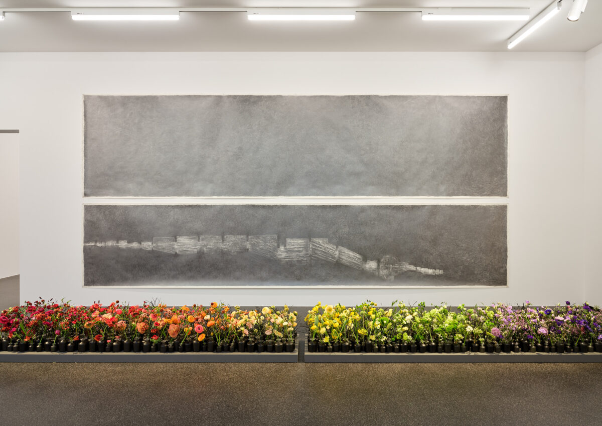 i
i
4.3.–9.3.2025
Florale Interpretation: Sandra Maarsen, Bern
Werk: Marianne Kuhn, Ohne Titel (2-teilig), 1990
Aargauer Kunsthaus
Foto: David Aebi, Burgdorf
The two-part drawing shows a cityscape consisting of countless graphite strokes and layers on the two six-metre-long strips of paper. The artist Marianne Kuhn, born in Aarau in 1949, presented this work for the first time in 1991 as part of a solo exhibition at the Aargauer Kunsthaus. She is known for her experimental work with graphite and black and white drawings. The artist works in a kneeling position and uses the minimal means of drawing to create an impressive variety of forms.
Attracted by the size and simultaneous simplicity of Kuhn’s drawing, the master florist ‘felt the rhythm of the countless layers of graphite that are deposited layer by layer on the paper.’ With her floral interpretation, Sandra Maarsen wants to ‘give a face’ to these layers of graphite with the colour palette of the rainbow and a wide variety of flowers. While from a distance, the colours of the flowers have the greatest impact, up close, the uniqueness of each individual flower becomes visible, similar to the individual graphite strokes.
Ferdinand Hodler + Ursina Huber und Martina Kistler
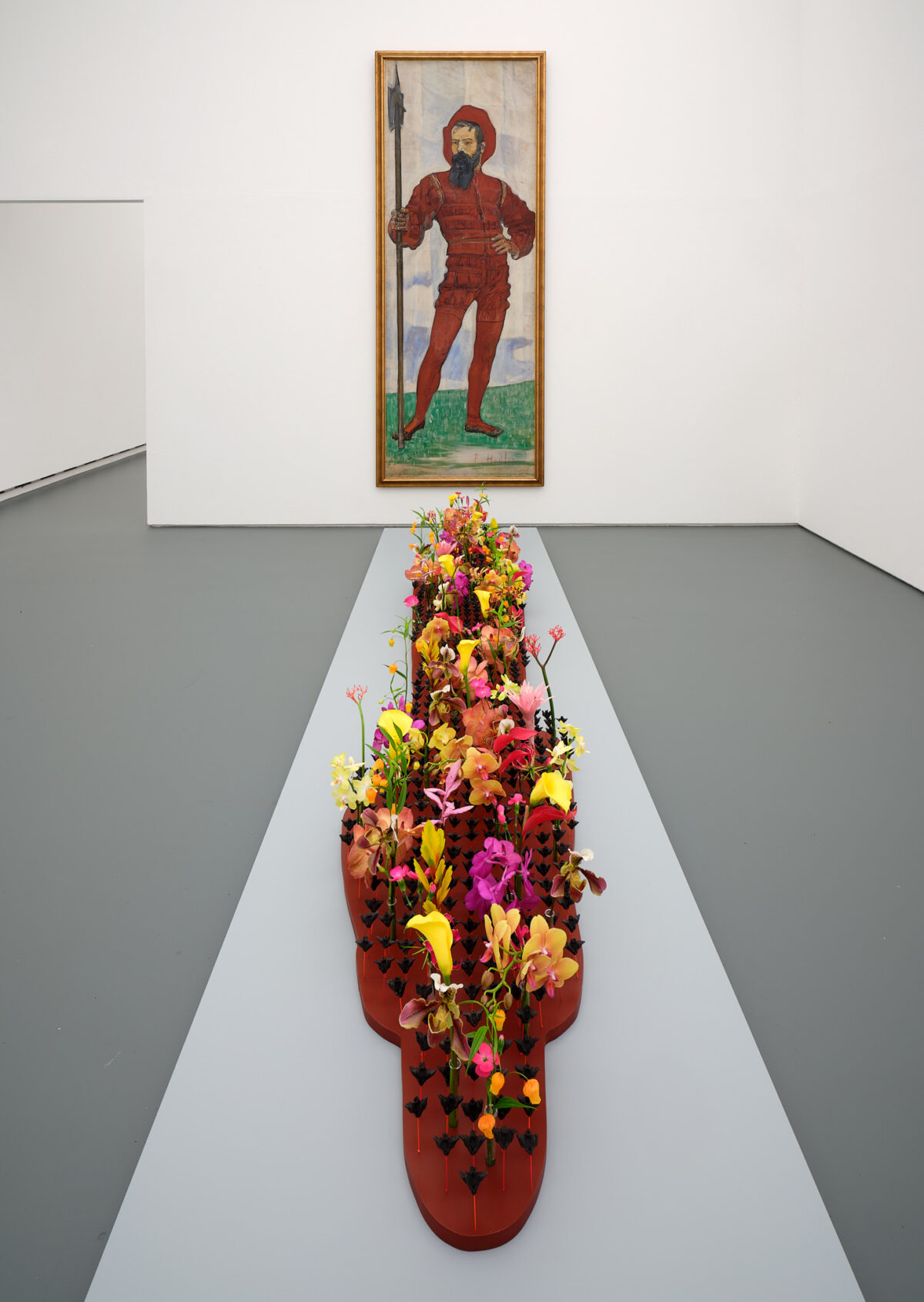 i
i
4.3.–9.3.2025
Florale Interpretation: Ursina Huber & Martina Kistler, Hünenberg
Werk: Ferdinand Hodler, Krieger (Landsknecht), 1895
Aargauer Kunsthaus
Foto: David Aebi, Burgdorf
In this portrait-format painting, Bern-born Ferdinand Hodler depicts an imposing soldier dressed in red with a dark beard and holding a halberd in his hand. The painting was presented at the Swiss National Exhibition in Geneva in 1896. Krieger (Warrior) is part of an ensemble of 26 paintings of the same size depicting male figures in traditional Swiss dress. The depictions reflected the Swiss endeavour for national unity. On closer inspection, it becomes clear that the layers of paint were applied quickly in order to optimise the monumental long-distance effect.
Florists Martina Kistler and Ursina Huber wanted to counter Hodler’s Krieger (Warrior) with ‘a powerful and challenging response’. Their floral interpretation is soft and slender, ‘similar to a shadow’. The various orchid blossoms come from foreign countries and have different shapes, which symbolises diversity for the two florists. The bright colours of the flowers, on the other hand, radiate strength and blend playfully into the design. Water nuts are arranged at regular intervals like small lances. They have a defensive effect, but at the same time bring clarity and structure, which stands for security and stability: ‘Now, in 2025, our counterpart is diverse, surprising and challenging at the same time!’
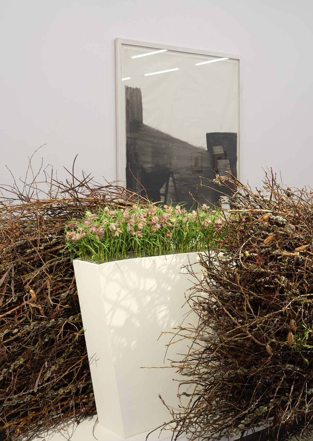
Alexandre Calame + Regi Bockhorni
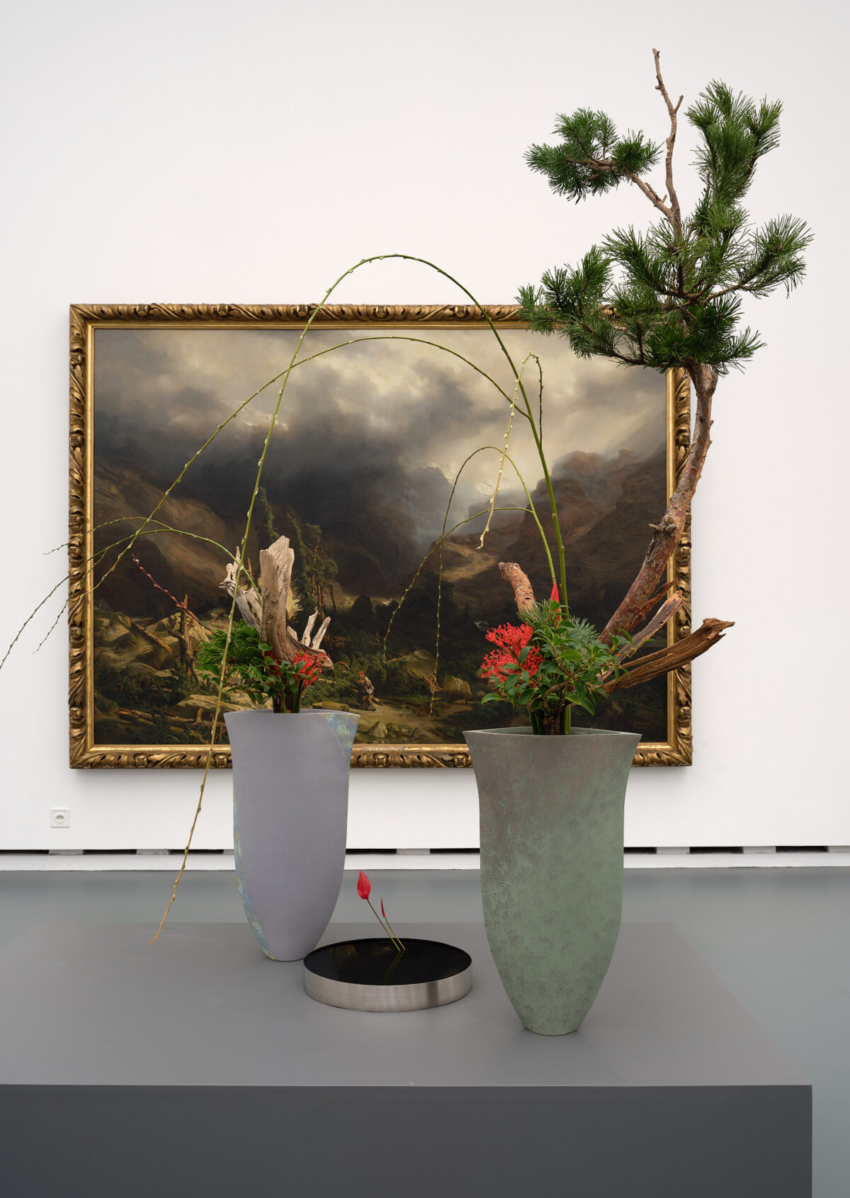 i
i
4.3.–9.3.2025
Florale Interpretation: Regi Bockhorni, Zürich
Werk: Alexandre Calame, Bergsturz im Haslital, 1839
Aargauer Kunsthaus / Depositum Alpines Museum der Schweiz
Foto: David Aebi, Burgdorf
Bergsturz in Haslital is an outstanding example of the painting of Alexandre Calame, who was born in Vevey in 1810. Impressive depictions of the Swiss mountain landscape are characteristic of his art. The painting lends nature a monumental, even violent dimension in which man appears small. In this work, a rocky mountain landscape disappears behind a dense, dark cloud. The trees by the stream – between piles of stones – appear shattered. Dramatic light and shadow effects contrast with Calame’s earlier idyllic Alpine landscapes.
The painting appealed to Regi Bockhorni because of the power of nature and life, to which we are sometimes powerless. After the landslide, there is still life among the broken branches and stones: A stunned couple sits among the rubble. Regi Bockhorni uses ikebana to recreate life with natural materials: Two tall vases combine pine trees, vriesea, coral flowers, anthuriums and dry branches. The present is present in the living pine branches, while the past is visualised in the morbid, broken branches. The green is to be understood as a reference to the future. The smaller vase in turn symbolises the couple humbly facing the power of nature.